
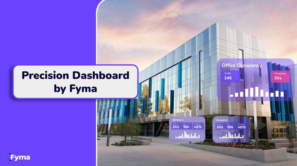
Introducing Fyma’s New Dashboard: Built for Impact, Informed by Clients
In commercial real estate, speed matters. Space usage changes by the day – or even the hour – and your team needs to understand what’s happening now, what changed last week, and how to plan for what’s coming next.
At Fyma, we’ve always focused on unlocking insights from space. But what we heard from clients across the industry was clear: the data was good…but it wasn’t fast enough to use at scale. Operations managers didn’t have time to click through layers of dashboards. Asset managers needed instant context. Analysts were spending hours reformatting data to share with internal teams and stakeholders.
So we listened. And we rebuilt.
Today, we’re proud to launch our new dashboard – a complete redesign of the way Fyma helps clients extract value from the rich behavioural data our AI captures through video feeds.
This isn’t just a design update. It’s a foundational shift toward clarity, context, and client impact.
The Problem We Solved
Many real estate analytics platforms overwhelm users with data. They surface raw numbers but leave clients to figure out the story. This leads to dashboards that are technically “insightful,” but practically hard to use.
Clients told us:
“Just show me what I need to know. I don’t want to dig.” (Co-working client)
“The monthly chart looks good, but I can’t tell how each weekday performed. Is Monday better than Thursday?” (Mixed-use portfolio lead)
“Can I just export what I see and share it with my team? We don’t want to rebuild charts in Excel.” (Office asset manager)
We took this feedback seriously. Our product, engineering, and design teams worked closely with these users to identify friction, redesign workflows, and prioritise what clients actually need in daily decision-making.
What’s New…and Why It Matters
1. Smarter Time Comparisons
Previously, clients had to select two separate time intervals to make a comparison. Now, we’ve streamlined this process.
You choose one interval – say, the last 30 days – and the dashboard automatically offers predefined comparisons:
- Previous week
- Same day last month
- Rolling 3-month average
- Customised internal benchmarks
Why this matters:
It reduces clicks and cognitive load. The question is no longer “what do I compare this to?”
It’s now, “what’s changed – and why?”
2. Daily and Hourly Breakdowns
Space performance varies dramatically across the week – and within each day. Our updated visuals now let you zoom into:
- Daily performance over time (e.g. Monday vs. Tuesday)
- Hourly usage patterns (e.g. 9 AM vs. 3 PM)
Why this matters:
It helps operations and security teams schedule resources, cleaning staff, or monitor occupancy spikes in high-traffic areas.
It also supports tenant experience teams in understanding when people engage most with specific areas (gyms, lobbies, food courts, etc.).
3. Trend Analysis Over Time
Spotting trends is essential for long-term planning. The new dashboard offers:
- Last 30 days
- Last 12 weeks
- Last 6 months
You can see whether a campaign, renovation, or seasonal shift is impacting footfall or occupancy in a meaningful way.
Why this matters:
Clients want to answer questions like:
- “Is our marketing driving traffic?”
- “Are we recovering from that post-renovation dip?”
- “Do our weekend patterns change in summer?”
With Fyma’s new insights engine, they now can.
4. Sensor-Level Transparency
Each insight now includes details on which virtual sensors contributed to the data. Want to know which entrance a specific figure relates to? Now you can.
Why this matters:
In commercial portfolios, data integrity is essential. Being able to trace the source of every number builds trust across teams and makes Fyma’s data usable across business units—from security to leasing.
5. Export Everything—Instantly
You can now export any insight or all insights into:
- PDF, formatted like the dashboard view (no reformatting needed)
- XLSX, structured exactly as seen in the platform
You can also schedule exports via email weekly or monthly to multiple stakeholders.
Why this matters:
Clients no longer need to recreate dashboards in PowerPoint or copy/paste charts into reports. With one click, your insights are boardroom-ready.
Who This Helps
For Co-Working Operators
You get at-a-glance visibility into peak usage times by location and hour—essential for scaling services, managing building access, and communicating with investors.
For Mixed-Use Asset Managers
Easily show tenants how foot traffic shifts by day, or justify rent increases on high-traffic corridors with real evidence.
For Office Portfolios
Track true occupancy by entrance, day of week, and floor—and align this with elevator traffic or card access data. Plus, with transparency on every insight, teams can confidently validate what they’re presenting.
Fyma’s Differentiation
We’re not a legacy people-counting tool. We’re not selling generic dashboards.
Fyma combines high-accuracy computer vision with purpose-built analytics and reporting tools designed specifically for CRE. We help clients make sense of spatial behaviour—not just count heads.
The new dashboard is an extension of that philosophy. It turns computer vision insights into decisions you can make today, without hiring a data team.
This is what happens when product and customer success teams build side-by-side, listening and iterating with our users—not in isolation.
Ready to see it in action?
Get in touch with our team — we’d love to show you what’s possible.